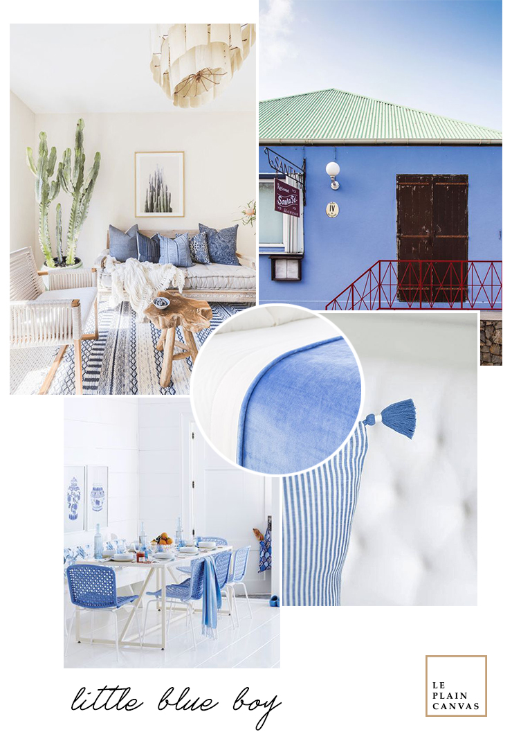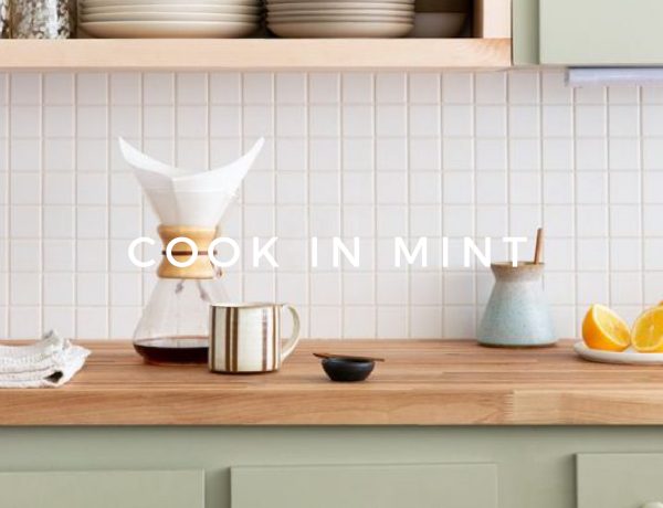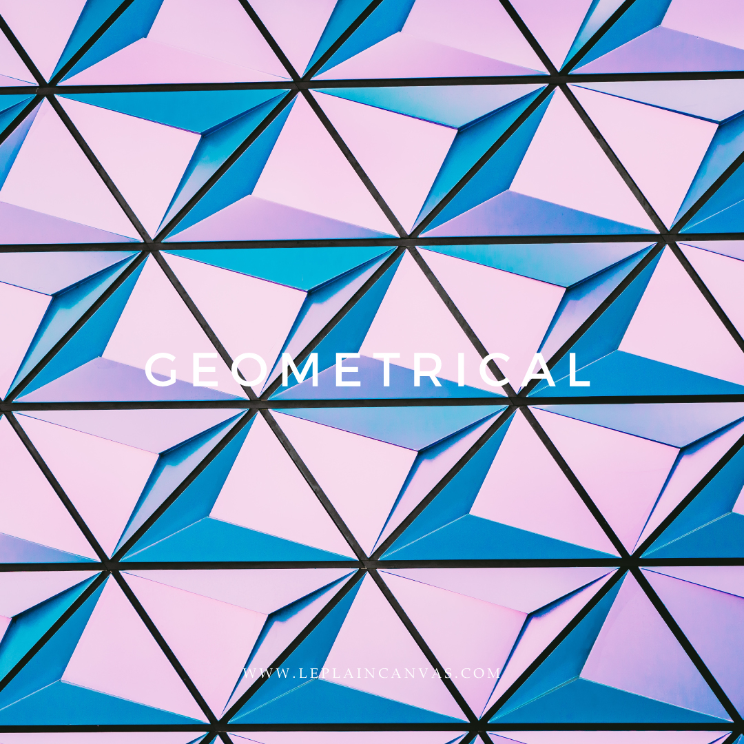
Pressman describes it as being both cool and fresh yet vibrant. It has verve. This blue offers a kind of lyrical escape. It’s an oasis for your eyes – luxurious and vivid. A visual delight that transports you beyond the banal. It speaks of the wide open firmament and summer and sun-lit sea.
Pretty glorious.
Think of the 60-30-10 model. You want to split your color scheme across this ratio with accents coming in at just 10%. This hue works really well to pique your palate – it’s super racy and adds spice. This particular hue works in well with greys and mustard to chartreuse tones. Look for inspiration and pair it with crisp white for fresh style. For high contrast, work in tandem with crimson red.
xoxo, Joe
Credit | All shots used on the mood board via our Pinterest boards.


No Comments